Creating a peaceful and relaxing atmosphere in your home can start with something as simple as choosing the right colors. Calm colors have a soothing effect, helping to reduce stress and promote a sense of tranquility. Whether you’re redecorating a room or selecting paint colors for your entire house, understanding how to choose calm colors can make a big difference.
In this post, we’ll explore practical tips for selecting calming hues and show you how to use them effectively in your home.
Why Choose Calm Colors for Your Home?
Before diving into specific color choices, it’s helpful to understand why calm colors work well in home interiors:
– Reduce anxiety: Soft, muted colors help lower stress and create a comforting environment.
– Promote relaxation: Calm tones encourage restful moods, perfect for bedrooms and living spaces.
– Create timeless appeal: Neutral and gentle shades tend to be classic and versatile.
– Enhance focus: In workspaces, calm colors can help improve concentration without distractions.
Popular Calm Colors to Consider
Certain colors are naturally soothing because of their associations and undertones. Here are some popular choices:
Blues and Greens
Blues and greens are often linked to nature — think of the sky and foliage. These colors evoke feelings of calm and freshness.
– Soft blue: A gentle blue can mimic clear skies and open water, perfect for bedrooms.
– Muted green: Sage or olive tones bring in an earthy vibe that feels nurturing.
– Teal: A blend of blue and green that offers calmness with a touch of sophistication.
Neutrals and Earth Tones
Neutral shades can help build a serene foundation in any room and pair easily with other colors.
– Warm beige: Adds softness and warmth without overwhelming the senses.
– Light gray: A modern neutral that feels clean and peaceful.
– Taupe: A balanced mix of brown and gray, perfect for a cozy but calm atmosphere.
Soft Pastels
Pale versions of colors like lavender, peach, or blush can add a hint of color while maintaining a tranquil mood.
Tips for Choosing Calm Colors
Here are some practical pointers to keep in mind as you select calm colors for your home:
1. Consider Natural Light
Natural light impacts how colors look throughout the day. Observe how sunlight enters the room and changes the color tones.
– North-facing rooms tend to have cooler light, so warmer calm colors can balance the space.
– South-facing rooms get warmer light, making cool colors like blues and greens even fresher.
– East or west-facing rooms experience changing light, so test paint samples at different times.
2. Use Color Samples and Swatches
Before committing to a color, test it out using samples or swatches on your walls.
– Paint large patches to see how the color feels in different lighting.
– Observe for a few days to ensure it remains calming.
3. Balance with Contrasting Tones
Even calm rooms can benefit from some contrast to add depth and interest.
– Pair soft colors with natural materials like wood, stone, or textured fabrics.
– Use darker or warmer accent colors in small amounts through cushions, rugs, or artwork.
4. Create a Color Palette
Building a cohesive palette around your chosen calm color can unify the room’s look.
– Combine three to four complementary colors or shades.
– Stick to a mostly monochromatic scheme with varying lightness and saturation to maintain calmness.
– Add subtle patterns to avoid monotony without overwhelming the senses.
5. Think About Room Function
The purpose of the room affects which calm colors work best.
– Bedrooms benefit from cooler and darker shades that help with relaxation and sleep.
– Living rooms can mix neutrals with soft blues or greens for inviting and peaceful social spaces.
– Bathrooms and kitchens can be refreshing with pastel tones or soft neutrals that boost calm energy.
6. Avoid Overly Bright or Saturated Colors
Bright, vivid colors tend to energize or stimulate, which can conflict with the goal of calmness.
– Steer clear of neon hues or intense reds and oranges in relaxation areas.
– If you want a pop of color, keep it in accessories rather than walls.
Applying Calm Colors in Your Home
Painting Walls
Walls provide the largest canvas for your chosen calm colors.
– Use light colors to make small spaces feel larger and airier.
– Consider an accent wall with a deeper calm tone for visual interest without overwhelming.
Furniture and Fabrics
Even if you prefer neutral walls, you can introduce calm color through furniture and soft furnishings.
– Upholstered chairs, sofas, and cushions in muted blues, greens, or pastels add tranquility.
– Curtains and rugs in calming shades can soften bright sunlight and define spaces.
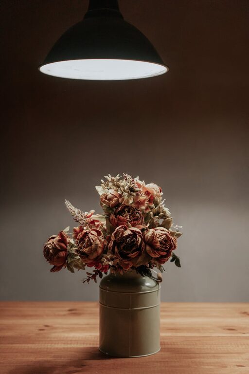
Accessories and Decor
Small touches can reinforce your room’s peaceful vibe.
– Vases, lampshades, and artwork in calm hues complement the main color scheme.
– Nature-inspired elements like plants or decor featuring leaf and water motifs enhance the calming effect.
Final Thoughts
Choosing calm colors doesn’t have to be overwhelming. Focus on your preferences, room lighting, and function, and test samples before finalizing. Remember, calm colors create a welcoming and restful home, so select shades that make you feel comfortable and at ease.
Your home can become a daily retreat simply by embracing colors that soothe your mind and spirit.
—
We hope these tips help you find the perfect calm colors for your space! Feel free to share your color choices or questions in the comments below.